Tail Wagging by Design: Colour That Calms Dogs and Charms Their Humans

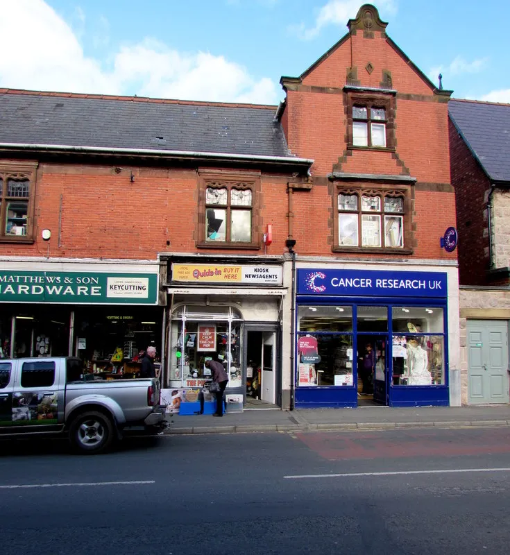
Photo: Jaggery , CC BY-SA 2.0, via Wikimedia Commons
Walk past a good independent dog groomer and you can often tell what kind of day they're having before you open the door. A bright chalkboard, a neatly lettered window, a van parked half on the kerb with a logo you could spot from the other side of the precinct. That's brand identity doing quiet work. Not barking at passers-by, just making the right people feel welcome and the nervous ones feel safe.
And make no mistake: dog grooming is a brand seen from the pavement, the pram, the passenger seat and the phone. The dog isn't reading your Instagram grid. The human is. So the colour choices have to do two jobs at once: settle the animal in the grooming room and reassure the owner who is about to hand over a beloved, muddy spaniel and hope for the best.
Skip the paw-print starter pack
We need to talk about the paw print. It is not evil. It is just everywhere. Paw prints, bone shapes, cartoon dogs in sunglasses and the word 'paw-some' have become the default uniform of pet businesses, and default uniforms are hard to recognise from a distance. If your logo could be swapped onto another groomer's shopfront without anyone noticing, you've got a colour problem as much as a logo problem.
A stronger route is to build a small palette around the feeling of your salon rather than the species of your customer. Are you the calm, clinical-but-kind groomer who handles anxious rescues? The breezy high-street stop for a Saturday spruce-up? The mobile service that turns up in a van and leaves the kitchen smelling of lavender? Each of those is a different colour story, and none of them needs a single paw to work.
If you must use a paw, treat it like a full stop, not wallpaper. One neat stamped mark on the back of a booking card is charming. A repeating paw-print pattern on every surface is a visual cul-de-sac.
Pick a palette that survives a wet Saturday
UK grooming is a wet-paw business. Your colours will be seen through steamed-up windows, on rain-speckled van panels and on cards that have been crammed into a coat pocket next to a half-eaten dog biscuit. So start with contrast and durability, then add the fun.
A practical base of two neutrals and two signals works well. Think oat and ink, or soft grey and deep green, with a bright accent such as coral, butter yellow or a clear sky blue. The neutrals do the calm work: signage, uniforms, interior walls, the background of your price list. The accents do the cheerful work: the open sign, the appointment card, the highlight covers, the little flash on the van.
Mid-tones are your friend. A muddy paw will find a pale cream floor before it finds a slate one. A wet nose will test a matte laminate before it tests a wipe-clean one. That doesn't mean everything has to look like a veterinary practice. It means choosing colours that still look intentional after a busy morning, not colours that only work in a photoshoot.
Calm for the dog, cheerful for the human
Dogs don't read logos, but they do read rooms. Strong colour contrasts and busy patterns can make a strange space feel busier than it needs to. Keep the grooming area lower in saturation: soft blues, sage greens, warm greys and muted teals tend to feel steadier than hot reds and acid yellows. Save the bright stuff for the parts of the brand that face the human: the window, the card, the social grid.
This is also where a little canine science helps. Dogs are not seeing the same spectrum we do, and blue-and-yellow contrasts tend to be more legible to them than red-and-green ones. You don't need to redesign your whole salon around a dog's eye view, but it's a useful check. If the entrance, the waiting bench and the grooming table are all a muddy brown-green blur, a clearer blue or yellow cue can help a nervous dog understand where to go.
For humans, cheerfulness comes from confidence, not from volume. A warm yellow accent on a deep blue background feels upbeat. A coral button on an oat card feels friendly. A single bright stripe on a navy van feels like a wave from across the street. You're aiming for 'oh, that looks nice and I trust them with my dog', not 'I have been shouted at by a colour'.
Shopfront: signals from the kerb
Your shopfront is a 3-second pitch. In that time, a passing owner needs to see what you do, how you feel and whether you're open. Colour can carry all three if you let it.
Use one strong brand colour on the fascia, keep the lettering high-contrast and resist the urge to fill every inch. A deep green fascia with cream lettering and a coral open sign will read from further away than a rainbow of decals. If you have a bay window, use a single colour block behind the price list rather than a patchwork of posters. And please make sure the opening hours are in a colour that doesn't disappear into the glass when the sun comes out.
A small, consistent detail goes a long way: a painted door frame, a colour-matched bench, a striped awning, a window vinyl in your accent colour. That's the sort of thing people remember when they're trying to describe you to a friend. 'The one with the blue door and the yellow sign' is a brand.
Van livery: a moving business card
A grooming van is a shopfront with an engine. It has to work in a lay-by, on a narrow residential street and in the rear-view mirror of a suspicious terrier. Keep the palette simple, make the name big and put the phone number somewhere it can be read by a human in a hurry.
A strong base colour plus one accent is usually enough. If your salon is sage and oat, the van can be sage with an oat panel and a coral phone number. If your brand is bolder, a deep blue van with a butter-yellow stripe will feel joyful without turning into a carnival float. Avoid full photographic wraps of dogs: they date quickly, they look busy at speed and they make the van hard to recognise from 30 metres away.
And think about the weather. Glossy dark colours look smart until a British winter covers them in road spray. Mid-tone colours hide the grime and keep the brand looking sharper for longer, which matters when the van is also your best mobile advertisement.
Booking cards and the kitchen pinboard
A booking card has a hard life. It goes in a pocket, on a fridge, under a magnet, into a diary and occasionally into a dog's mouth. That makes it a brilliant little brand asset. Use the back for the next appointment, the front for your colours and a single clear line about what you do.
Choose an uncoated or lightly textured card that feels nice in the hand, then add a wipe-clean laminated version for the salon. Round the corners if you like: it feels friendlier and survives the bottom of a bag better. Keep the palette to your two neutrals and one accent so the card still looks like you when it's covered in someone else's handwriting.
A loyalty card can follow the same system: one colour block, one clear stamp area, one small mark that isn't a paw print. A simple bone outline, a scissors icon or a tiny cloud of bubbles will feel more distinctive than another paw. The dog doesn't care. The human sticking it to the fridge does.
Instagram templates that don't look like everyone else's
You don't need a 40-slide brand bible to look consistent on social media. You need three or four colour pairings and the discipline to use them. A before-and-after post can sit on your oat background with an ink caption and a coral label. A story highlight can be a solid colour block with a simple icon. A price list can be a single image in your palette rather than a screenshot of a spreadsheet.
Keep the grid from becoming a scrapbook. If every post uses every colour, the brand disappears. If every post uses the same two or three colours with one accent, the grid starts to look like a place. That's what you want: a place people recognise before they read the name.
A small colour system, not a mood board
The best dog groomer brands aren't the ones with the most decorations. They're the ones where the window, the van, the card and the Instagram all feel like they came from the same brain. Pick a calm base, one cheerful signal, a high-contrast text colour and a rule about where each one lives. Then test it in the real world: in the rain, under a wet nose, on a fridge door and at 30 paces across a car park.
If it still looks like you, you've got a brand worth wagging about. And not a paw print in sight.