Sorted by Heart: Building a Charity Shop Identity That Shoppers Can Read at a Glance
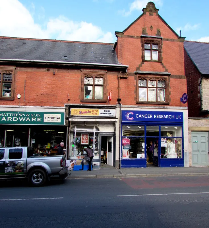
Photo: Jaggery , CC BY-SA 2.0, via Wikimedia Commons
Charity shops are one of the great British high-street inventions. They are recycling centres, community noticeboards, volunteer training grounds and the best place in town to find a 1970s fondue set for £4. But walk past a row of them and the visual identity is often a scramble: laminated A4 notices, three logos from different decades, a window full of donation appeals and a handwritten sign about a sofa. The cause is clear. The shopping experience is less so.
That is where colour can do some quiet, practical work. Not a full corporate rebrand. Not a rainbow of stickers slapped on the door. A colour identity that helps shoppers understand where they are, what to do and why it is worth a browse. Here is a playbook for charity shops that want to look as thoughtful as the work they fund.
Start with one colour that means come in
Most charity shops already have a cause colour — often inherited from a national brand, sometimes chosen decades ago. The trick is to give that colour a job. Pick one hero colour and use it consistently on the things that matter: the shopfront frame, the donation door, the volunteer badge, the price-tag header. Not every surface. Just enough that a shopper could spot the shop from across the street and know it belongs to a real place with a real purpose.
Pair it with two neutrals — a warm white and a deep charcoal work well — and one action accent for things like opening hours, Gift Aid reminders or a call for volunteers. That is the whole palette. A tight system is more useful than a cheerful crowd of competing colours, especially when the stock itself is already a kaleidoscope.
The window is a shopfront, not a noticeboard
Charity shop windows carry a lot of pressure. They have to say thank you, ask for donations, promote the cause, advertise opening hours and show off a rail of coats. No wonder they often end up as a collage of paper.
Try zoning the window instead. Give the left-hand side to donations and practical information, the centre to one strong seasonal display, and the right-hand side to the cause or a local story. Use colour-blocked vinyl panels rather than lots of separate posters. A bold shape in the hero colour can frame the display and hide the visual noise behind it. Removable window vinyl is affordable, easy to update and much smarter than blue-tack corners.
The aim is not to make the window look like a fashion boutique. It is to make it look intentional. A shopper should be able to read it in three seconds: this is a charity shop, this is what they need, this is what I might find.
Pricing tags are tiny brand assets
Price tags are probably the most repeated piece of design in the entire shop. They are also usually an afterthought. A scruffy tag makes a good donation feel like clutter; a clear tag makes a £3 jumper feel like a find.
Design a simple tag template with the hero colour, a clean price field and a small category marker. Colour-code the categories — books, clothes, homeware, kids, bric-a-brac — but keep the palette limited. If everything is colour-coded, nothing is. Use the accent colour only for special finds or new-in stock, and leave the rest in neutral tones with a coloured edge.
Volunteers should still be able to handwrite the item and price. That handwritten bit is part of the charm. Give them a template that makes their handwriting look considered rather than chaotic, and keep a stack of pre-printed tags by the till.
Uniforms that volunteers will actually wear
A full uniform can feel corporate and costly. A single bright apron, badge or tote bag can do the same job with more warmth. Choose one item in the hero colour so volunteers are easy to spot on a busy shopfloor, then let people wear their own clothes underneath. Comfort matters when you are sorting bags, steaming clothes and lifting boxes.
Badges can carry the personality. A simple printed badge with a first name and a tiny line like Ask me about books or Happy to help with Gift Aid gives shoppers permission to start a conversation. It also makes the shop feel human rather than branded into silence.
Donation-point signage: reduce friction, increase generosity
Donation signage often tries to say everything at once. A better approach is to answer the three questions people actually have: when can I drop things off, what do you accept, and what happens next? Use pictograms, short lines and the hero colour on the donation door or bay. Keep the registered charity number visible but small and calm — trust cues should reassure, not shout.
If there is a queue or a loading bay, use floor vinyl or a simple A-board to mark it. Colour is excellent at showing the route: follow the blue line to the donation door, drop bags in the green zone, speak to the person in the orange apron. That is wayfinding doing the work of five separate notices.
Turn the shopfloor into a colour map
Inside, charity shops can be overwhelming in the best way. A little colour-coded wayfinding helps shoppers stay in discovery mode rather than confusion mode. Give each zone a colour and a simple shape: books, clothes, homeware, media, childrenswear. Use shelf strips, wall dots or hanging signs rather than a full signage system. The colours should be visible from the door and repeated at the till.
The system has to survive second-hand chaos. Keep the graphics big, few and high up. Do not rely on tiny labels that vanish behind a stack of puzzles. A coloured band above a rail is more useful than a beautiful poster nobody can see.
Keep the community warmth
A colour system should not iron out the local oddities that make charity shops lovable. Leave space for handwritten volunteer picks, local event notices and seasonal displays. The brand provides the frame; the community provides the colour inside it. That balance is the whole point.
Start with a one-page palette, a tag template, a window layout and a volunteer badge. Test it for a month, then ask the people behind the till what is working. The best charity shop identity is not the tidiest one on the high street. It is the one that makes a shopper feel welcome, useful and just curious enough to walk in.