Spines, Signs and Shopfronts: Colour Lessons from Britain's Independent Booksellers
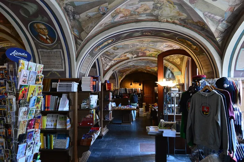
Photo: Scotch Mist, CC BY-SA 4.0, via Wikimedia Commons
Walk down almost any UK high street and you can spot them a hundred yards off: the shopfront that isn't afraid of a bit of pigment. While the chain retailers settle into safe greys and muted navy, independent bookshops have spent the last few years turning themselves into little beacons of colour. It's not just pretty — it's strategy. In a market where a warehouse in a business park can undercut you on price, colour is one of the few things an independent can do better, louder and more personally than anyone else.
So what's actually going on with the branding of Britain's indie booksellers in 2026? And what can a florist, a barber, a deli or a tiny online retailer learn from a shop that sells paperbacks?
Why colour does the heavy lifting for a bookshop
A bookshop has a problem most retailers don't: its product is already a riot of colour. Hundreds of spines, all competing, all shouting. The walls, the bags, the shelf talkers and the signage have to hold that chaos together without competing with it. Get it wrong and the shop feels like a jumble sale. Get it right and the brand colour acts like a frame around a very busy painting.
That's why so many independents have landed on a single, saturated house colour — a deep teal, a tomato red, a mustard, an unapologetic coral — and then used it with discipline across everything from the fascia to the receipt stamp. It's the visual equivalent of a friendly member of staff saying "start here".
The shopfront as a first sentence
A bookshop's exterior is its opening line. The best ones in 2026 treat the shopfront as a piece of brand identity rather than a bit of property maintenance: painted timber in a strong signature shade, a hand-painted name in a typeface with a bit of character, a window display that changes with the season but always sits on the same colour backdrop.
The trick is restraint. One dominant colour, one accent, and then let the books provide the confetti. That's a lesson that transfers directly to any small shop: pick your colour, commit to it, and stop worrying that it 'won't go' with everything. It isn't meant to. It's meant to be recognisable.
Shelf talkers, spinners and the art of the handwritten note
Anyone who has browsed an independent knows the joy of a shelf talker — those little handwritten cards from booksellers recommending a title. In 2026 they've become a proper branding asset: printed on a consistent coloured card stock, with a house typeface, sometimes with a little stamp or sticker in the brand palette.
It's a small thing, but it's doing a lot of work. It signals curation (a human has read this), it adds warmth, and it turns a generic shelf into a conversation. If you run a shop of any kind — a deli, a record shop, a garden centre — the same idea applies. A coloured, branded recommendation card is cheap to print, easy to refresh, and quietly tells customers that someone here actually cares.
Tote bags: the walking billboard
Let's talk about the tote. The humble cotton bag has become the most effective piece of print an indie bookshop owns. Good ones are screen-printed in one or two bold colours, with a design that reads clearly from across the street. They get carried to markets, on trains and around supermarkets, doing more brand awareness than most paid advertising.
From a print and production angle, it's a masterclass in keeping things simple: one or two spot colours, a strong silhouette, and a bag worth keeping. It's also a reminder that branded merchandise works best when the design is confident enough that people want to use it — not so covered in logos that it becomes a leaflet with handles.
Reading groups, events and printed ephemera
Here's where the real colour nerds show up. Bookshops run reading groups, author events, children's story hours and book fairs, and all of it needs print: posters, tickets, bookmarks, name badges, little folded programmes.
The strongest examples in 2026 treat this ephemera as part of the identity rather than an afterthought — the same two or three colours, a consistent typeface, and a bit of playful layout. Posters are designed to be photographed and shared, bookmarks become collectables, and the whole programme feels like a set. For small businesses running workshops, classes or events, this is the takeaway: don't design each poster from scratch. Build a colour and type system once, then let it carry you through a whole year of print.
The practical playbook for small retail brands
If you're a small UK retailer looking at all this and wondering where to start, here's a short version of what the independents are doing well:
- Pick one signature colour and use it relentlessly. Not a palette of nine. One that people will start to associate with you.
- Let the product supply the variety. Your brand colour is the frame; your stock is the picture.
- Print small and often. Shelf talkers, bookmarks and recommendation cards are cheap, quick to produce and easy to update.
- Make your shopfront a piece of design. A painted timber fascia and a hand-lettered name will out-charm a plastic sign every time.
- Treat merch as media. A good tote or a well-designed notebook travels further than a leaflet ever will.
Colour as a welcome mat
The real reason colour works so well for indie bookshops isn't aesthetic — it's emotional. A bold, warm shopfront says come in. A coloured recommendation card says someone's been thinking about you. A tote bag says you're part of something. In an age where so much of retail happens on a screen, that physical, pigmented, human signal is worth more than ever.
And it's available to any business with a paintbrush, a printer and a bit of nerve. Penguin proved the point back in the 1930s when it colour-coded its paperbacks by genre — orange for fiction, green for crime, and so on. Nearly a century later, colour is still doing what it does best: helping people find the thing they didn't know they were looking for.
So next time you pass a bookshop with a window in a shade of green that shouldn't work and somehow absolutely does, take note. There's a brand strategy in there, and it's probably worth borrowing.