The Kettle, the Quiz and the Colour Scheme: Branding the UK's Volunteer-Run Spaces
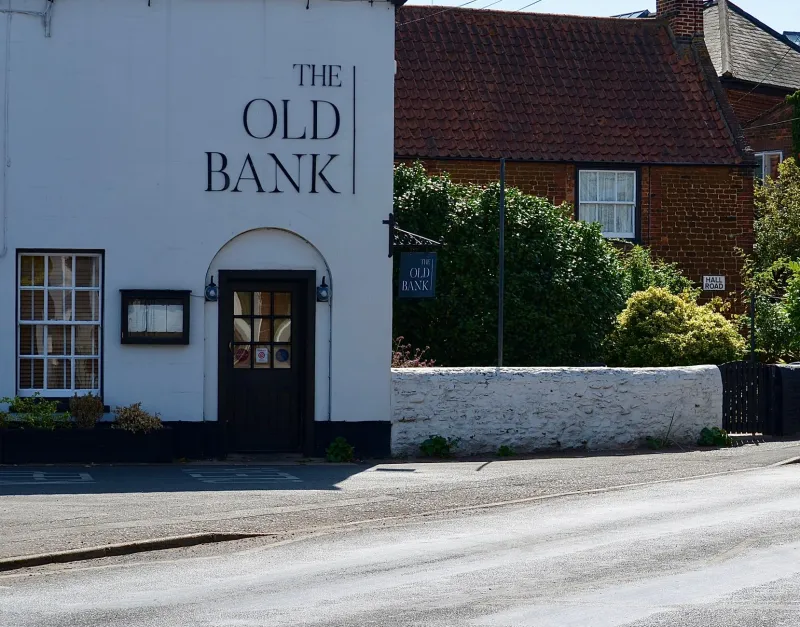
Walk into many UK village halls and you can smell the tea urn before you see a sign. The noticeboard is a collage of curling A4 sheets, the website was last updated by someone who has since moved to Devon, and the colour scheme is best described as 'photocopier beige'. None of that means the place lacks identity. It means the identity is buried under admin.
Community halls, repair cafés, volunteer libraries and small arts spaces are the connective tissue of British neighbourhoods. They host the quiz night, the toddler group, the council meeting, the birthday party and the emergency food drop. They need branding that says 'come in' rather than 'keep out' — and they need it to work for people who are giving up their Tuesday evening to make it happen.
Start with the people, not the palette
A community organisation is not a startup with a founder's favourite hue. Its identity has to hold together a parish council, a book group, a group of teenagers learning to fix bikes and a 78-year-old who runs the raffle. So begin with listening, not moodboarding.
A coffee-morning workshop can do more than a survey. Ask people what colours they associate with the building, the street, the market or the park nearby. Ask what they want the place to feel like on a cold Wednesday in February. The answers are often surprisingly specific: the green of the recreation ground, the red of the old phone box, the yellow of the daffodils by the bus stop. Those are better brand anchors than a generic 'community blue'.
This is also how you build trust. If locals choose the colour, they will defend it. If a designer drops in a palette from a trend report, it will be quietly ignored by the next committee.
Build a palette that can survive a parish council meeting
Small organisations need fewer colours than they think, but they need them to be tough. A workable community palette usually has three jobs:
- One anchor colour that does the heavy lifting on signs, doors and headers.
- One warm accent for events, highlights and calls to action.
- One grounding neutral for forms, timetables and the inevitable photocopied agenda.
Choose the anchor for contrast, not just charm. Pale yellow on white is lovely in a moodboard and useless on a laminated notice. Deep teal, brick red, forest green, aubergine or a strong mustard can all feel welcoming without disappearing in bad light. Test the palette in the actual hall: near the entrance, by the kitchen hatch, in the corridor with the flickering strip light.
Accessibility is not a luxury here. Many community spaces serve older people, people with visual impairments and people who are stressed or in a hurry. Check contrast for text and signage. Never rely on colour alone to show which door is which. Pair colour with words, numbers, symbols or patterns.
Signage that says 'come in' rather than 'keep out'
The fastest win is often the front door. A vinyl welcome sign, a clear opening-hours panel and a bright arrow to the main entrance can transform how a building feels. Avoid the classic mistake of covering every surface with a different typeface. One bold headline style and one clear body style is enough.
For village halls, a simple external sign with a strong colour block and a short name can do more than a full rebrand. For repair cafés, a hand-painted or illustrated repair symbol adds personality without a huge print bill. For volunteer libraries, shelf-end labels in the brand colours make the whole place feel cared for.
Use colour to guide people, too. A red line to the toilets, a blue panel by the booking desk, a green dot on the accessible entrance. It does not need to be a grand wayfinding scheme; it needs to be consistent enough that people learn it in one visit.
Print budgets for real-life volunteers
Nobody wants a brand that only works on a designer's monitor. Community print budgets are usually measured in raffle-ticket money, so build a system that can be produced cheaply and repeatedly.
A few practical moves:
- Design a one-colour or two-colour template that works on a basic office printer and on a local litho run.
- Use recycled uncoated stock for flyers and programmes; it feels friendlier and hides the odd smudge.
- Create a reusable A3 poster template with space for handwritten event details.
- Specify a durable vinyl for outdoor signs and a matte laminate for anything handled often.
- Keep a folder of plain-text and logo files that volunteers can actually find.
And write the guidelines on one page. If the brand book is longer than the tea rota, it will not be read.
Make it easy to keep going
A community identity is less about a logo and more about a set of habits. Give volunteers a shared folder with the logo, the colours, three poster layouts, a social media template and a short note on tone of voice. Run one training session — in the hall, with biscuits — and show people how to use it.
Most importantly, leave room for mess. The summer fete poster will be made at 11pm by someone who is not a designer. The brand should still look recognisable when it is printed on neon paper and sellotaped to a lamppost. That is not a failure. That is the point.
When a community space gets its colours right, the effect is quietly powerful. The hall stops looking like a room that happens to host things and starts looking like a place that belongs to the people who use it. The kettle still matters. But so does the sign that tells you where to find it.