The Pre-Show Is the Brand: Colour and Craft for UK Independent Cinemas

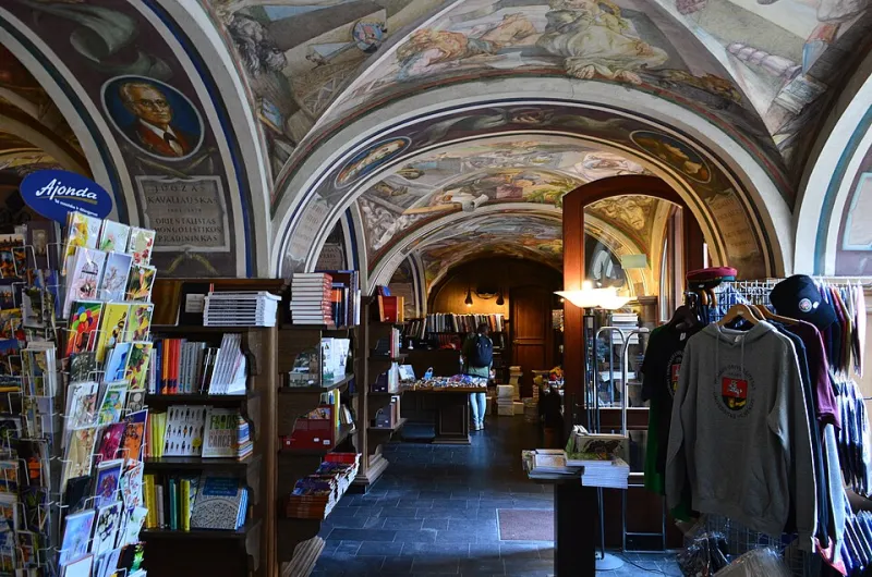
Photo: Warren LeMay from Chicago, IL, United States, CC BY-SA 2.0, via Wikimedia Commons
There’s a particular magic to an independent cinema before the film even starts: the fizz of a foyer that smells faintly of popcorn and old carpet, the rustle of a programme, the moment the house lights dip. Streaming can offer almost anything except that. So when UK independents compete for attention in 2026, their identity has to work harder than a logo on a website. It has to turn a night out into a brand you can feel.
The good news is that colour is one of the most affordable, flexible tools in the box. A considered palette can make a listed building feel alive, help a repertory season read at a glance, and make a £4 ticket stub worth sticking on the fridge. The trick is to treat the cinema as a system — not a single mark — and to let the personality show up everywhere from the marquee to the merch table.
Start with the foyer, not the logo
Many small venues begin identity work by commissioning a logo and then trying to force it onto every surface. It’s usually better to work the other way round. Walk into your building and look for the colours that already exist: the terracotta tiles, the green tiles in the loo, the red velvet curtain, the neon from the chip shop opposite. Those are the ingredients your audience already associates with you.
A useful starting point is a palette of three core colours and one accent. Heritage shades — deep green, oxblood, mustard, navy — give instant warmth and age. A sharper accent, such as acid yellow, coral or electric blue, stops the whole thing from drifting into dusty museum territory. Use the heritage colours for large surfaces, wayfinding and print backgrounds, then let the accent do the interrupting: the price on a ticket, the arrow to Screen 2, the line under a season title.
This is also where accessibility matters. Test type contrast at dusk, under foyer lighting and on a phone screen. A beautiful burgundy and gold combo is no good if the showtimes are unreadable from the queue.
Marquee lettering is still the original billboard
Nothing says “cinema” like a marquee. Whether yours is original 1930s metalwork or a modern lightbox, the lettering is a brand asset. The mistake is to treat it as an afterthought — a scramble of plastic letters in whatever order they come out of the box.
Give the marquee a simple colour rule. For example: film titles in one colour, times in another, and a single accent colour for the word “TONIGHT” or “SOLD OUT”. Keep the typography consistent, even if the letters themselves are mismatched. If your venue has a vintage letter set, lean into the wonk — but give it a strong background colour so the words pop. A deep charcoal board with cream letters and one hot-pink highlight can look purposeful rather than chaotic.
Practical notes: check legibility from the pavement, not just from the box office. Photograph it at 7pm in winter. If the rain has turned the letters into a grey blur, you need more contrast, not more decoration.
The ticket stub is a tiny poster
Ticket stock is one of the most underrated bits of print in the building. It passes through hands, gets photographed, gets kept. For independents, a beautifully designed ticket can do the job of a business card, a souvenir and a reminder to come back.
You don’t need expensive foil or a bespoke die-cut to make an impression. A strong colour block, a clean typeface and a bit of wit go a long way. Consider a single spot colour on a cream stock, or a season ticket that changes colour for each programme strand. If you use thermal printers, design within their limits — but don’t let that stop you from using coloured paper or a pre-printed band across the top.
Memberships and loyalty cards deserve the same treatment. They live in wallets for years. A bold edge colour or a satisfyingly chunky typeface can make them feel like a club you want to belong to, rather than a receipt you forgot to throw away.
Screen idents with a bit of personality
Before the trailers, you’ve got a captive audience and a chance to say who you are. A five- to ten-second screen ident is enough. It doesn’t need to be a mini film; it needs to be recognisable.
Think of it as a moving extension of your palette. Maybe the accent colour sweeps across the screen like a curtain. Maybe your marquee letters flicker into life. Maybe it’s simply your name in a strong typeface over a textured background, with a sound that regulars start to associate with a good night out.
Use colour to code your programming. Repertory screenings could carry one background, family matinees another, late-night cult screenings another. Audiences learn these cues quickly, and it helps your printed programme, website and social posts feel like one coherent world. Keep the system loose enough that it doesn’t become rigid — the joy of an independent cinema is that it can change its mind.
Merch people will actually wear
Cinema merch has moved well beyond the branded hoodie. The best examples feel like pieces of design in their own right: a tote with a brilliant line from a film, a sweatshirt in a colour that matches the auditorium curtains, an enamel pin of the building’s facade.
For small venues, the rule is: don’t put the logo on everything. Pick one or two products and make them good. A heavyweight tote in a strong colour with simple, well-set type will outsell a flimsy garment with a cluttered back print. Limited-edition runs for seasons or anniversaries give people a reason to buy now — and they make your brand feel alive rather than merchandised to death.
Balancing heritage charm with contemporary punch
Most independent cinemas sit between two worlds: the listed building with its original features, and the audience who expect a clean website and a decent flat white. The identity has to hold both. That doesn’t mean sanding off the character. It means giving the character a clear frame.
Audit what you already have. Keep the original brass sign, the worn wooden banister, the handmade letter set. Then introduce a disciplined colour palette and a type system that can live across print, screen and signage. The contrast between old fabric and sharp new graphics is often where the magic happens — a fuchsia ticket against a crumbling plaster wall, a clean sans-serif against a hand-painted fascia.
A small-venue checklist
- Choose three core colours and one accent, then use them consistently.
- Test contrast in low light and on mobile screens.
- Give the marquee a simple colour hierarchy.
- Treat tickets, memberships and programmes as keepsakes.
- Make a short screen ident that can flex across programme strands.
- Limit merch to a few well-made pieces.
- Keep one foot in heritage and one in now.
Independent cinemas don’t need to look like multiplexes to compete with them. They need to look like somewhere worth leaving the house for. Get the colour, type and print working together, and the brand starts before the opening credits — in the queue, on the ticket, and all the way home.