Colour on the Menu: A UK Field Guide to Appetite-Led Print
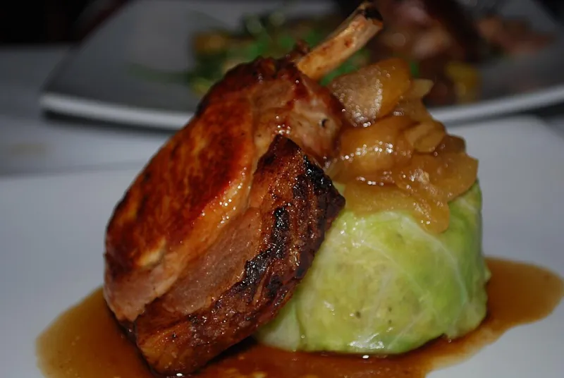
Photo: avlxyz, CC BY-SA 2.0, via Wikimedia Commons
Menus are not just lists. In the UK's independent café scene and the restaurant groups that borrow its energy, the menu is often the first proper piece of brand design a customer holds. Colour is doing a lot of quiet work: nudging appetite, setting expectations about price, and making sure everyone can actually read what is on offer. Here is how UK operators are using bold palettes, high-contrast type and clever print finishes — plus what to put in a brief before you sign off a redesign.
The menu is a brand asset, not a laminate afterthought
A menu has to survive greasy fingers, low table light and a server rushing past. But it also has to carry the brand. When a Bristol brunch spot picks a tomato-red cover and a chunky grotesque headline, it is telling you something before you read a single dish. When a Manchester small-plates group uses a deep green cover with a single bright accent, it is setting a different tone: considered, seasonal, a bit more grown-up.
The practical point is that colour choices on a menu are never neutral. They frame the food, the price and the room. A menu that looks cheap can undermine a £14 main; a menu that looks too precious can make a £6 pastry feel like a trap. The sweet spot is a palette that feels intentional and still does its job in bad lighting.
Appetite is not one colour
The old advice about red and yellow making people hungry is only half useful. Saturated warm colours can feel generous and immediate, which is why they show up on everything from burger menus to bakery bags. Greens and blues can signal freshness or calm, but they can also cool a room down. The useful lesson is contrast and context, not a magic swatch.
A deep tomato red on uncoated stock can feel warm and tactile. The same red on glossy card can feel fast-food. A soft green works beautifully for a deli board, but set pale grey type on top and you have made a menu that disappears under a hanging bulb. The colour has to work with the stock, the type and the venue — not just on a screen in a design studio.
Cover colour sets the price point before the first course
Independent cafés often use one bold cover colour as a signal: bright cobalt for a coffee bar with a playful streak, burnt orange for a neighbourhood bistro, acid yellow for a lunch spot that wants to feel quick and cheerful. Restaurant groups tend to build a tighter system: one primary cover colour, secondary section colours, and a consistent type palette across menus, signage and staff aprons.
That consistency matters more than any single shade. If the menu cover is saturated and the website is pastel, the brand feels patchy. If the menu is bold but the specials board is a tired photocopy, the colour story falls apart. UK operators briefing a redesign should decide where the boldest colour lives: cover, section opener, price column or photography backdrop. Trying to make every element loud is the fastest route to visual mush.
High-contrast type is a hospitality issue, not a nicety
Accessibility is often treated as a digital concern, but menus are held at arm's length in dim rooms. Pale grey on cream is a common own goal. So is tiny type in a light-weight script. WCAG contrast ratios are a useful starting point even for print, especially for body copy and prices. Test the menu in the actual room, at the actual table, under the actual lighting.
Colour alone should not carry meaning. If vegetarian, vegan or allergen information is marked only with a small coloured dot, some customers will miss it. Use icons plus text, keep type sizes readable, and avoid putting essential details over busy food photography. Accessibility is also commercial: a menu that is hard to read slows service and loses orders.
Print finishes that make food photography pop
Food photography needs accurate colour and clean contrast. A soft-touch laminate can look premium, but it can also dull the punch of a hero dish. Heavy texture behind small type is another trap. Ask your printer for a proof under the same lighting as the venue, and be honest about whether the menu will be wiped clean every day or replaced weekly.
Uncoated stocks can feel warmer and more sustainable, but they absorb ink differently. Recycled stocks can shift colour, so choose a printer who understands the material and will test the palette. Spot UV on a single dish can be a nice touch, but only if it does not make the rest of the page look flat. The goal is not to show off the finish; it is to make the food look worth ordering.
Build a menu system for seasonal changes
UK menus move with the seasons, and a bold palette should not lock you into a costly reprint every six weeks. Design a modular template: one constant cover colour, a small set of section colours, and inserts for specials. Print smaller batches. Keep the type palette stable while the accent colour shifts. That gives you freshness without losing recognition.
A practical brief for UK menu redesign
- Start with the room: light levels, table size, viewing distance and whether the menu sits on a wall or in a hand.
- Pick one appetite colour and one anchor dark for type. Build the rest around them.
- Test contrast in situ, not just on screen.
- Specify stock, finish and proofing before the artwork is signed off.
- Design for updates so seasonal changes do not mean a full reprint.
- Put accessibility in the sign-off checklist, including icons plus text for key information.
- Ask your printer about recycled stocks, PVC-free finishes and inks that suit the job.
Bold colour on a menu is not decoration. It is a service tool, a price signal and a brand handshake. Get it right and the second course feels like the obvious next move.