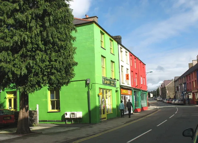
Greige Fatigue: How Bold Colour Is Rewiring the UK Workplace
Photo: Jorge Láscar from Australia, CC BY 2.0, via Wikimedia Commons
Somewhere between the third hybrid-working refit and the slow trudge back to the desk, something shifted. The greige era — that long, cautious stretch of oatmeal, taupe, “warm grey” and the dreaded porridge — is finally losing its grip on UK workplaces. In 2026, the offices, studios and co-working floors that people actually want to spend time in are doing something altogether louder.
Not loud for the sake of it. Loud with intent.
How beige became the safe answer
Cast your mind back to the fit-outs of the late 2010s. Landlords specified greige because it photographs well and offends nobody. Contractors liked it because it hides scuffs. Employers liked it because it felt “professional” — a word that, for about a decade, meant as close to invisible as possible.
The problem is that invisible spaces produce invisible brands. If your reception could belong to any of forty companies on the same business park, your environmental graphics aren't doing a job — they're doing a shrug.
The dopamine refit, minus the chaos
The phrase doing the rounds is “dopamine colour”, and like most trend labels it's half useful and half nonsense. What it really describes is a shift in hierarchy: colour moves from decoration to navigation, from accent to architecture. A saturated wall isn't there to be pretty. It's there to tell you where you are, which way to walk, and what kind of company you've just walked into.
It's also cheaper than it looks. Paint is one of the last genuinely affordable design tools left in a fit-out budget — a few hundred pounds of it can do more for how a space feels than another ten grand of furniture.
Three rules worth taping to the wall:
- One hero surface per zone. A single colour-drenched wall, stairwell or lift lobby beats a scattergun of accents every time.
- Sixty–thirty–ten. Sixty per cent neutral base, thirty per cent supporting tone, ten per cent the loud one. It's an old interiors rule and it still holds.
- Let the building do the neutral. Ceilings, floors and corridors can stay quiet so the colour has something to push against.
Pairings that survive real British light
North-facing rooms cool every colour down; a south-facing glass box will bleach it out by 2pm. Put test patches on at least two walls and look at them at 9am and again at 4pm before you commit to anything.
Some combinations earning their keep this year:
- Cobalt #1F5AE0 + saffron #F2B300 + chalk #F5F2EA — confident, a little Dutch, brilliant for reception and wayfinding.
- Terracotta #C75B39 + sage #8FA98A + cream #F4EFE4 — softer and warmer; suits older buildings with heritage brick.
- Deep plum #4B2A5E + acid lime #C9E265 — high contrast, perfect for a studio that wants to look like it has opinions.
- Teal #00857C + coral #FF6F59 — friendly without tipping into childish; good for client-facing meeting rooms.
- Ink navy #16233F + bubblegum #EF9FC0 — the unexpected-red trick in pink form. One punchy element against a very sober base.
Keep legibility in mind: aim for at least 4.5:1 contrast on anything people have to read, and 3:1 for large wayfinding graphics. Colour vision deficiency affects roughly one in twelve men, so never let hue alone carry meaning — pair it with a number, a word or a shape.
Manchester: colour as a corridor
Ancoats has become the test kitchen for this stuff. One co-working operator took a former textile building and left almost everything alone — exposed brick, timber, the lot. Then they drenched the main stair core in cobalt and ran a saffron stripe along the floor from the entrance to the lifts.
Nobody gets lost any more, and the lobby has turned into the most photographed spot in the building, which is an employer-brand asset whether or not anyone planned it. By their own estimate, the paint cost was a rounding error next to the furniture budget.
Bristol: wayfinding with a personality
Over in Bedminster, a design studio in one of the Paintworks units went the other way — neutral walls, but every floor coded to a colour lifted from the neighbourhood: riverside green, the orange of the flyover at sunset, a purple borrowed from a Stokes Croft mural. Floor numbers are stencilled in the same hue, and it reappears on project folders and pitch templates.
That last bit matters. When your wayfinding palette is also your brand palette, you stop paying for it twice.
Employer branding starts at the door
Recruitment is a visual medium now. Candidates see your corridor long before they see your job spec. A few low-cost moves:
- Give every interview room one strong wall — it becomes the backdrop for every photo you'll ever take.
- Print the wayfinding properly. Vinyl lettering that's peeling says more about your attention to detail than any values statement.
- Colour-code the onboarding: lanyard, notebook, first-week pack. Cheap, memorable, and it makes a new starter's desk look deliberate.
The small-business version
You don't need a fit-out budget. You need one wall and a decision.
Start with the surface clients actually see: reception, the meeting room, the wall behind your desk on video calls. Paint it. Then repeat that same colour at ten per cent scale — signage, service menu, packaging tape, folder spines, the footer of your templates. Consistency reads as confidence, even on a shoestring.
Things to avoid: full-colour everything (it flattens into mush), accent walls in rooms with no natural light (they go muddy by November), and trend colours picked off a screen. Order a sample pot. It's the cheapest design decision you'll make all year.
The takeaway
Greige wasn't wrong, it was just unfinished. The UK workplaces getting noticed in 2026 treat colour as infrastructure — a way to move people around, signal personality and make a Tuesday feel less like a Tuesday. Pick one colour. Commit to it. Let the building breathe around it.