Bright Lights, Bold Systems: Giving the Great British Arcade a Brand Worth Queuing For
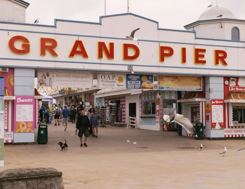
Walk along almost any UK promenade and you can feel the arcade before you see it. The clatter of coins, the low hum of cabinets, the smell of hot doughnuts drifting through the door, the carpet that seems to have been designed by a very excited laser printer. Seaside arcades are already a full sensory brand experience. The problem is that most of them don’t have a brand system holding it all together.
Too often, the identity stops at a retro sign and a website that hasn’t been touched since the penny slot era. The result can feel like nostalgia wallpaper: familiar, but flat. In 2026, there’s a real opportunity for UK arcades to build something sharper — an identity that respects the past without dressing up as it, and that works just as hard for day-trippers, families and design-conscious locals as it does for the holiday photo album.
Start With the Noise, Not the Logo
An arcade isn’t a quiet brand. It’s a place of overlapping messages: prize cabinets, ticket redemption counters, change machines, queue barriers, staff T-shirts, inflatable aliens hanging from the ceiling. Before anyone opens a design app, map the moments where the brand has to show up. What does the queue look like on a rainy Saturday? Where do people get stuck? Which corner turns into a bottleneck because nobody can tell where the token machine is?
That map becomes your brief. The identity should survive the noise, not compete with it. A simple system of three bold primaries, one deep neutral and one warm off-white is often enough. Think electric cyan, tomato red and a confident yellow, grounded with ink black and a soft paper white. It’s playful without becoming a children’s party, and it gives every touchpoint a clear job.
Signage That Works at 100 Metres and One Metre
Promenade signage has one job: stop the stroll. Big colour blocks, high contrast and a wordmark that can be read through a rain-streaked window are your friends. A hand-painted look can be charming, but it needs a sturdy typographic backbone. Pair one characterful display face for headlines with a no-nonsense sans for information. If the display face is a circus, the sans is the person with the clipboard.
Inside, wayfinding is where most arcades lose the plot. The room is dark, bright, loud and full of flashing lights. Don’t rely on small text. Zone the space by colour instead: one primary for the change machine, another for ticket redemption, another for toilets and exits. Add simple pictograms and repeat them on printed floor stickers, hanging signs and the back of tickets. It sounds basic because it is. But in a room designed to distract, basic is a kindness.
Print That Feels Like Part of the Game
Tickets and tokens are not admin. They’re souvenirs. They’re the things people shove in a pocket and find again on Monday morning. That makes them a brilliant place to put the brand.
Use edge-to-edge colour on tickets, or a pattern system drawn from the arcade’s own shapes: perforations, token rings, cabinet stripes, pixel grids. Sequential numbering can become a design feature rather than a printer default. Prize bags, receipt wallets and staff aprons can all carry the same visual rhythm. Keep the stock sensible — recycled papers and vegetable-based inks where possible — because a brand that shouts about the seaside shouldn’t leave a trail of plastic behind it.
QR codes are useful, but they don’t have to be ugly. Give them a colour block to live in and a clear instruction. “Scan for today’s prize list” beats a lonely square floating in white space.
Merch That Leaves the Promenade
The best arcade merch doesn’t look like merch. It looks like a small poster you happen to be able to carry. Tote bags, enamel pins, postcard sets, sticker sheets and tea towels can all borrow the same bold primary palette and condensed type. Avoid the generic “I love [town name]” trap. Instead, design something that feels like it could only come from this arcade: a token pattern, a ticket stub graphic, a slogan pulled from the prize cabinet.
This is also where the brand travels. A good tote bag on a train to Leeds or a sticker on a laptop in Bristol does more for a seaside arcade than another leaflet rack. Just don’t fill the shop with landfill tat. A few well-made things beat a wall of novelty rubbish every time.
A Palette With Salt in It
Primary colour can tip into primary-school colour if you’re not careful. The fix is texture and restraint. Use big blocks of red, blue and yellow, then let a wet-sand grey, a deckchair stripe or a sun-faded secondary accent do the supporting work. That gives you the energy of the arcade without the pastel pastiche that makes so many seaside brands feel like a themed wedding.
Pattern is your secret weapon. A simple stripe can wrap a ticket, line a shelf, edge a window decal and print on a bag. A dot grid can become a wayfinding motif. A token ring can become a logo lockup. The system doesn’t need to be complicated. It needs to be repeatable.
Don’t Forget the Locals in January
Day-trippers are lovely, but locals keep the lights on in February. The brand has to work in the off-season, too. That might mean a locals’ loyalty card, a winter quiz night poster, or a bright window display that gives the high street a pulse when everything else is shuttered. Colour can signal season and event: a summer palette for the promenade rush, a tighter evening palette for grown-up events. Same system, different volume.
The 2026 Opportunity
Seaside towns across the UK are busy rewriting their own stories. Arcades can be part of that, not just a rainy-day fallback. The winning identity won’t be the one that shouts loudest. It’ll be the one that turns the noise into a system: bold primaries, clear typography, print that feels collectable, wayfinding that respects a distracted brain, and merch people actually want to take home.
Build a brand that clinks, flashes and folds neatly into a tote bag. That’s the arcade worth queuing for.